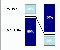
Pareto analysis is a very simple technique that helps a manager to choose the most effective changes to make. It is represented as a bar graph used to arrange information in such a way that priorities for process improvement can be established. Pareto charts are constructed to provide a before-and-after comparison of the effect of control or quality improvement measures.
The Pareto Effect
The 80:20 theory was first developed in 1906, by an Italian economist, Vilfredo Pareto, who observed an unequal distribution of wealth and power in a relatively small proportion of the total population. This fact gave rise to the Pareto effect or Pareto’s law: a small proportion of causes produce a large proportion of results. Thus frequently a vital few causes may need special attention wile the trivial many may warrant very little. It is this phrase that is most commonly used in talking about the Pareto effect — ‘the vital few and the trivial many’.
Pareto Charts
Pareto charts provide a tool for visualizing the Pareto principle, which states that a small set of problems (the “vital few”) affecting a common outcome tend to occur much more frequently than the remainder (the “useful many”). A Pareto chart can be used to decide which subset of problems should be solved first, or which problems deserve the most attention.
The Pareto Chart is used to illustrate occurrences of problems or defects in a descending order. It is used for making decisions at critical points in different processes. This means that it can be used both during the development process as well as when products are in use, e.g. customer complaints.
Pareto charts are a key improvement tool because they help us identify patterns and potential causes of a problem. Several Pareto charts can be created out of the same set of data. This will help a manager to quickly scan a number of factors that might contribute to a problem and focus on those with the greatest potential payback for his efforts
Steps to create a Pareto Chart:
- First step is to list all elements of interest
- Use the same unit of measurement and measure each of the elements.
- Order the elements according to their measure
- Calculate the percentage for each element out of the total measurement
- Accumulate the percentage from top to bottom to equal 100 %
- Create a bar and line graph, line representing cumulative percentage
- Work on the most important element first
Pareto Analysis is also used in inventory management through an approach called “ABC Classification“. The ABC classification system works by grouping items by annual sales volume. This helps identify the small number of items that will account for most of the sales volume and that are the most important ones to control for effective inventory management. Thus it helps in effective inventory management.

